Dear Data is a book (published in 2016) by two designers, Giorgia Lupi and Stefanie Posavec, who for a year exchanged postcards from London and New York, in which the message was the ever-changing graphic visualisation of information about their daily lives (encounters, journeys, joys, disappointments, moods, seasons, etc.). The original drawings were acquired by the Moma in New York, and the book has become a classic of ‘data visualisation’. The story of the transformation of data into signs and drawings, and the postcards about cities, are available here.
A possible application after lockdown
As a result of not going out much and reducing the number of places one can go to, certain parts of one’s city begin to seem much further away than they are (or seemed to be before). By dint of no longer going to certain places, the way to reach them in the memory begins to present gaps and jumps. It is likely that during lockdowns the mental image of the city – as Kevin Lynch puts it (The Image of the City) – is being transformed. Routes, junctions and points of reference are shifted, reduced, suspended on a map that is no longer the same.
We need help from Giorgia Lupi and Stefanie Posavec, the authors of the Dear Data project: during 52 weeks, the two artists sent each other postcards, one from London and the other from New York, in which their daily lives were graphically visualised.
People they met, negative thoughts, laughter, swearing, commitments, contacts, mistakes, movements were transformed into data, represented in the most diverse forms, from star charts, to inflorescences, geometric figures, spots, lists and so on. Once drawn on postcards, these dear data were sent to each other, until they formed a whole that was beautiful to look at and question.
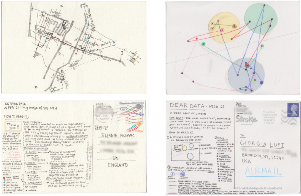
One of these postal exchanges concerns their respective cities.
Giorgia Lupi, from New York, is inspired by Lynch’s book and draws a mental map of her routes without consulting any maps; Stefanie Posavec summarises her relationship with London in three large circles joined and crossed by coloured lines, each colour representing a type of relationship with the circled area (work, study, residences).
Exercise: drawing a path from the past
Insight
Wild Mazzini Gallery: Italian artists and data visualisation
Giorgia Lupi Ted 2017: Come ritrovare noi stessi attraverso i dati – How to find ourselves through data
Giorgia Lupi ted 2019: Finding Humanity in Data